
ByTheMedium
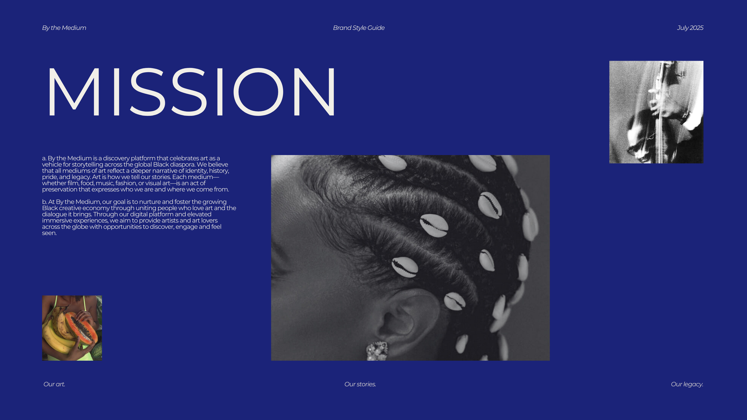
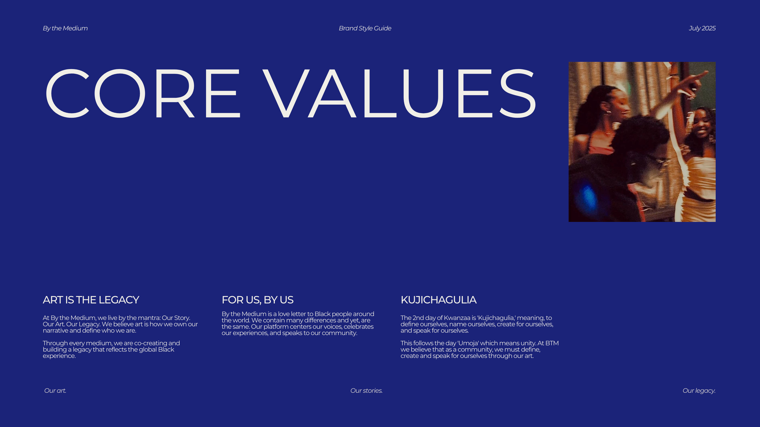
By the Medium is a discovery platform that celebrates Black expression across all mediums — film, food, music, fashion, and visual art. Rooted in the values of legacy, community, and storytelling, the brand needed a strong visual identity system to unify its editorial voice, digital presence, and event experiences.
The Challenge
The client sought a brand that felt both editorial and timeless, while also remaining community-driven and expressive. The identity had to balance elegance with raw authenticity, ensuring it resonated with both artists and audiences across the Black diaspora.
My Role
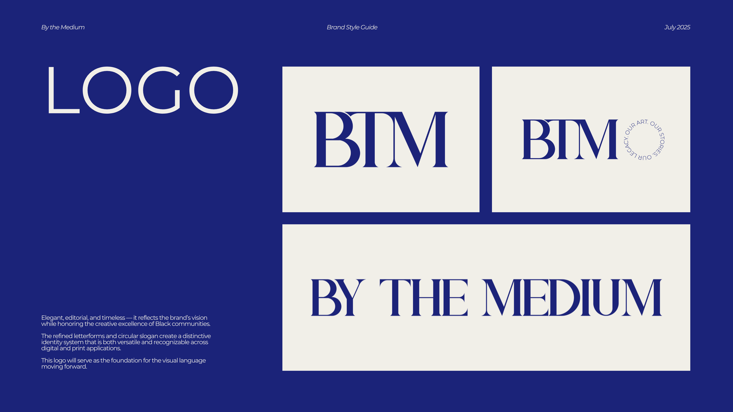
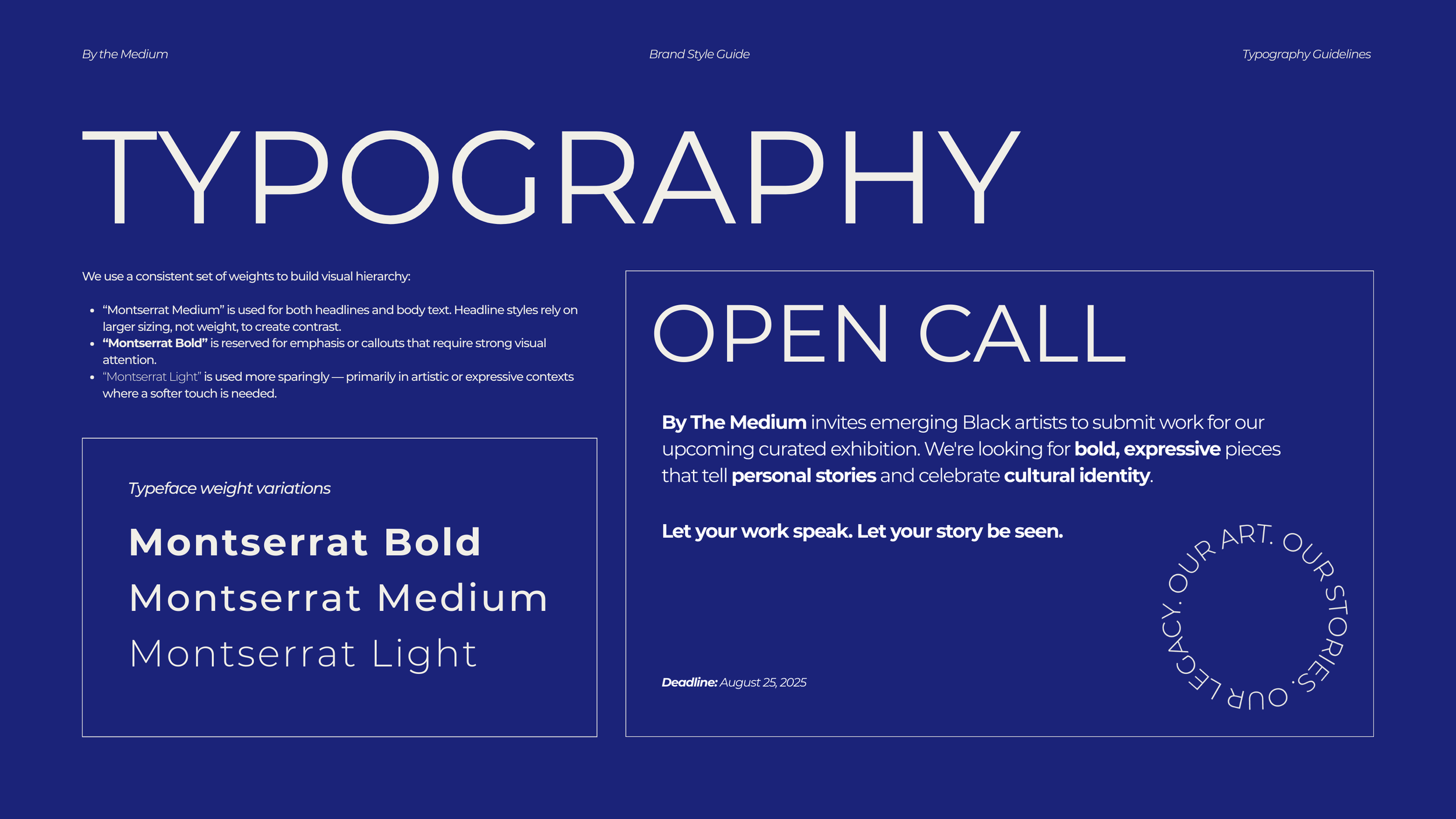
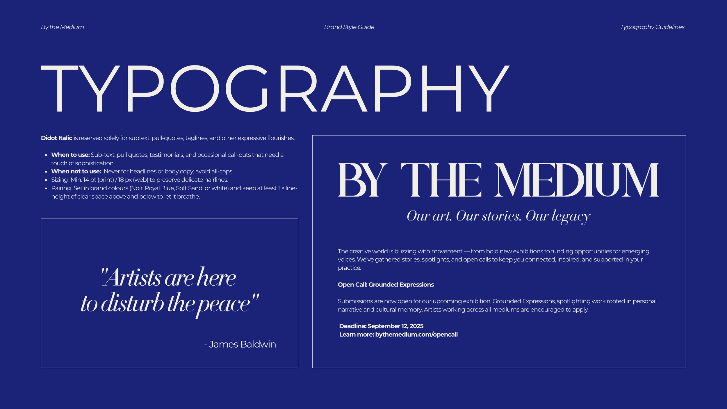
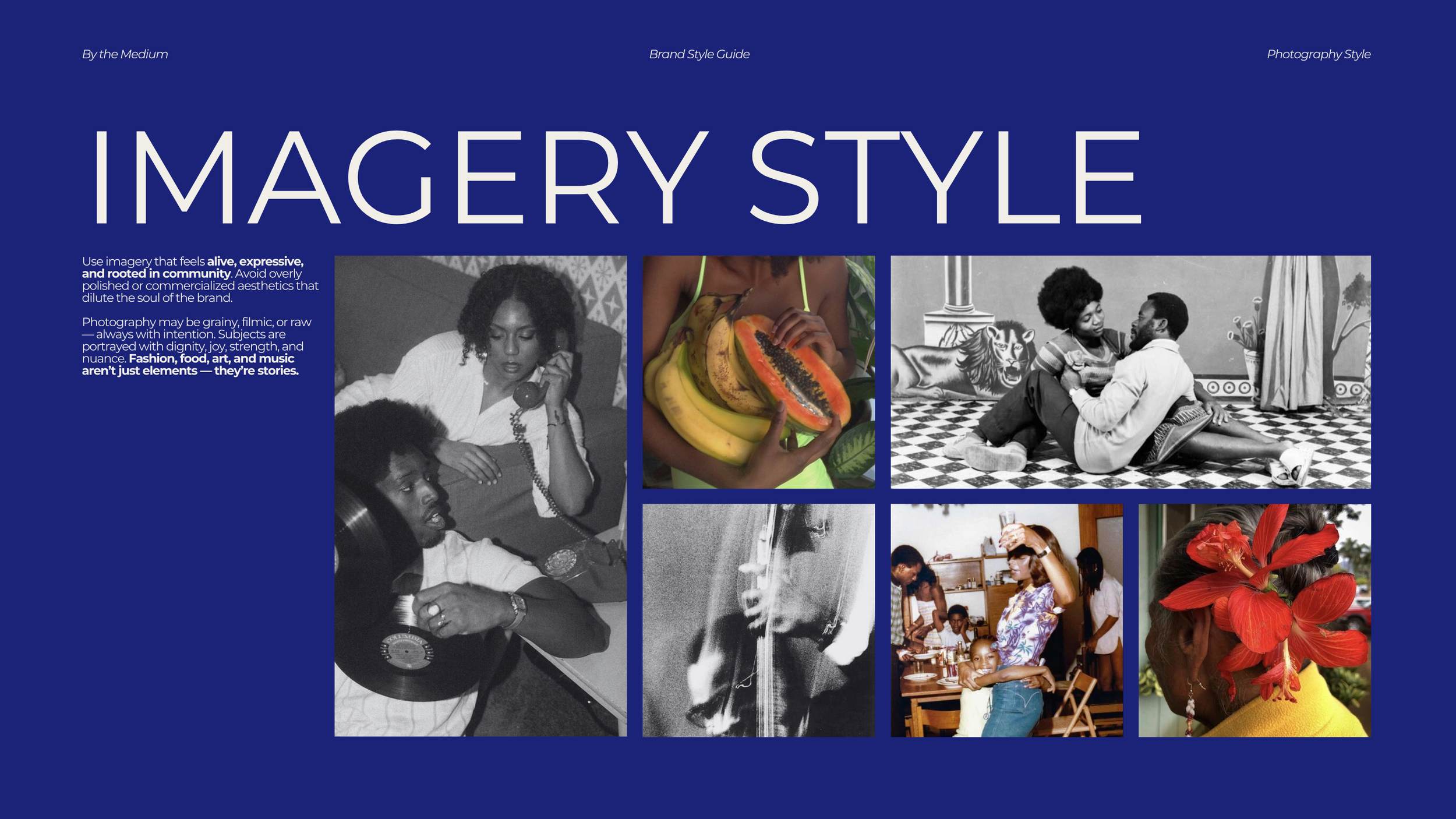
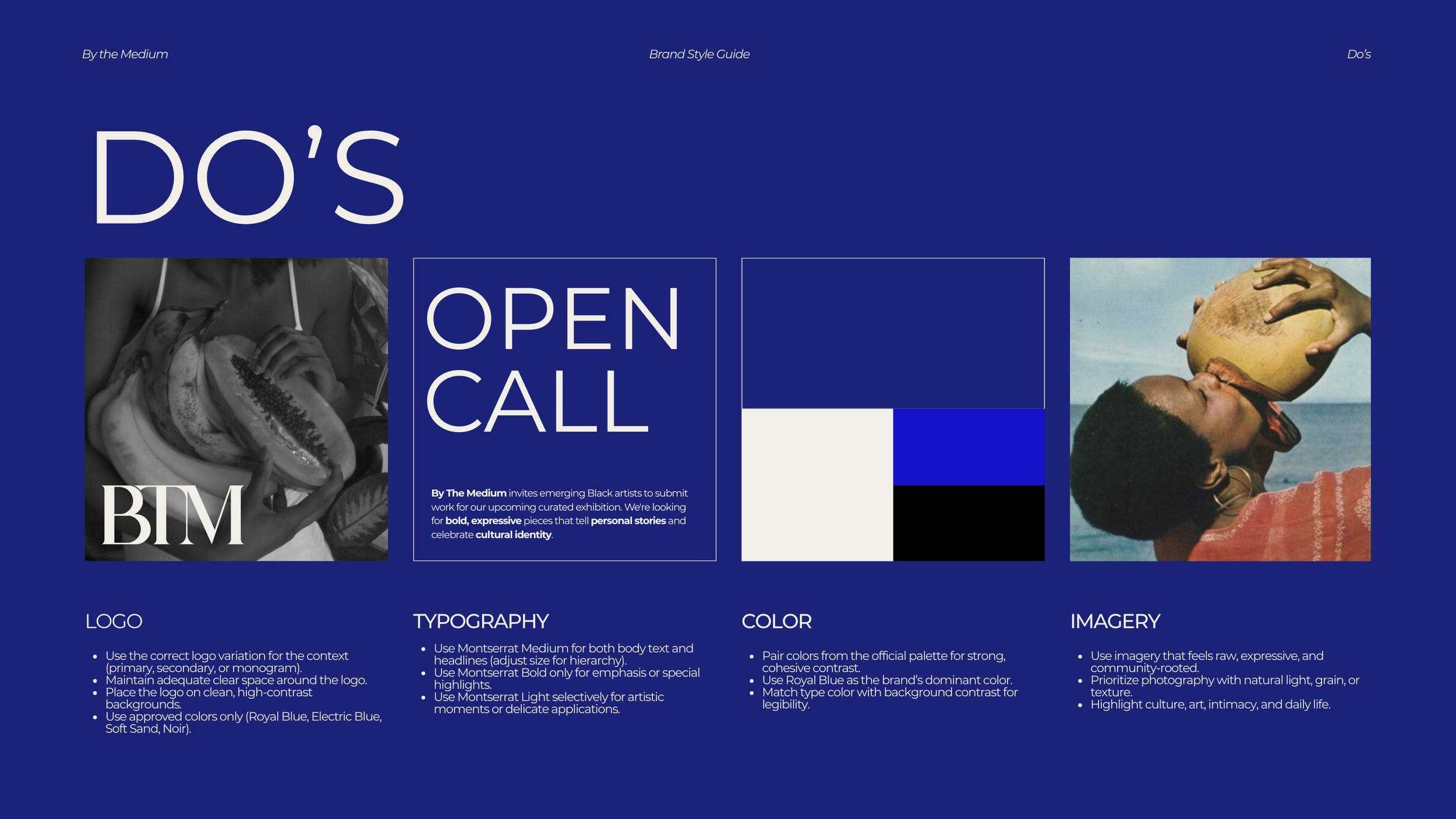
I created the brand style guide, which defined the visual and verbal language of By the Medium. This included:
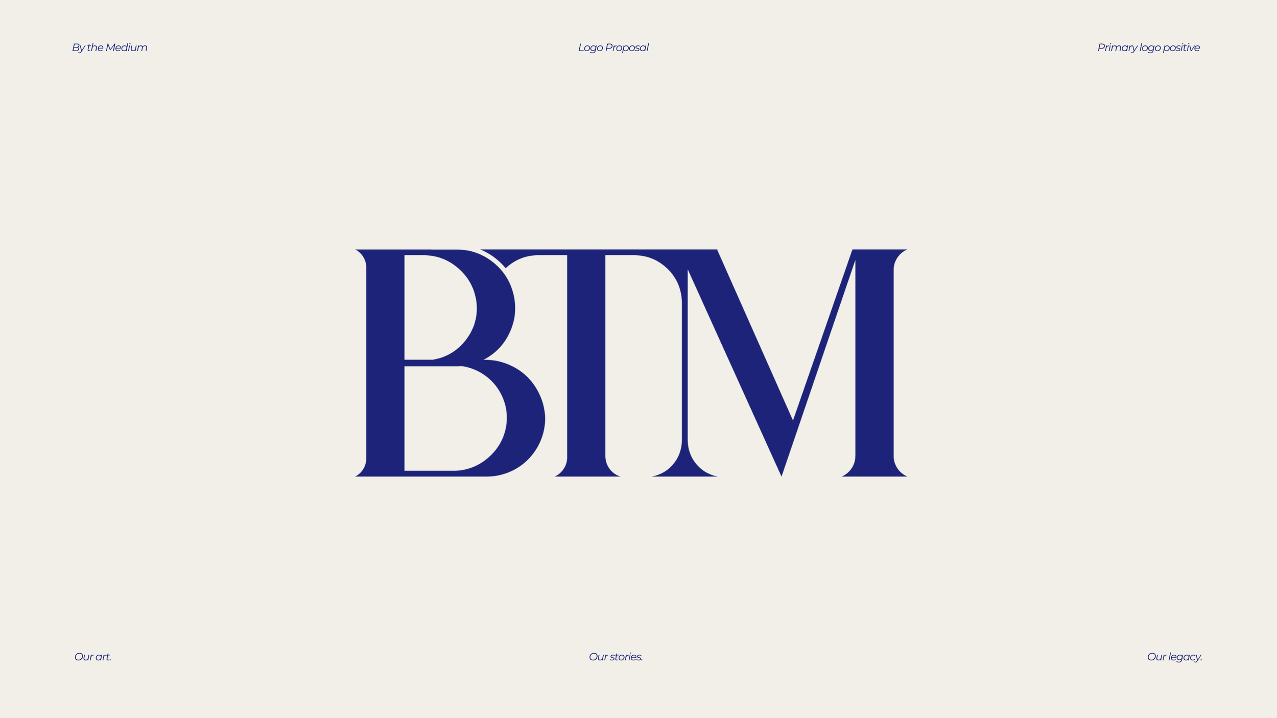
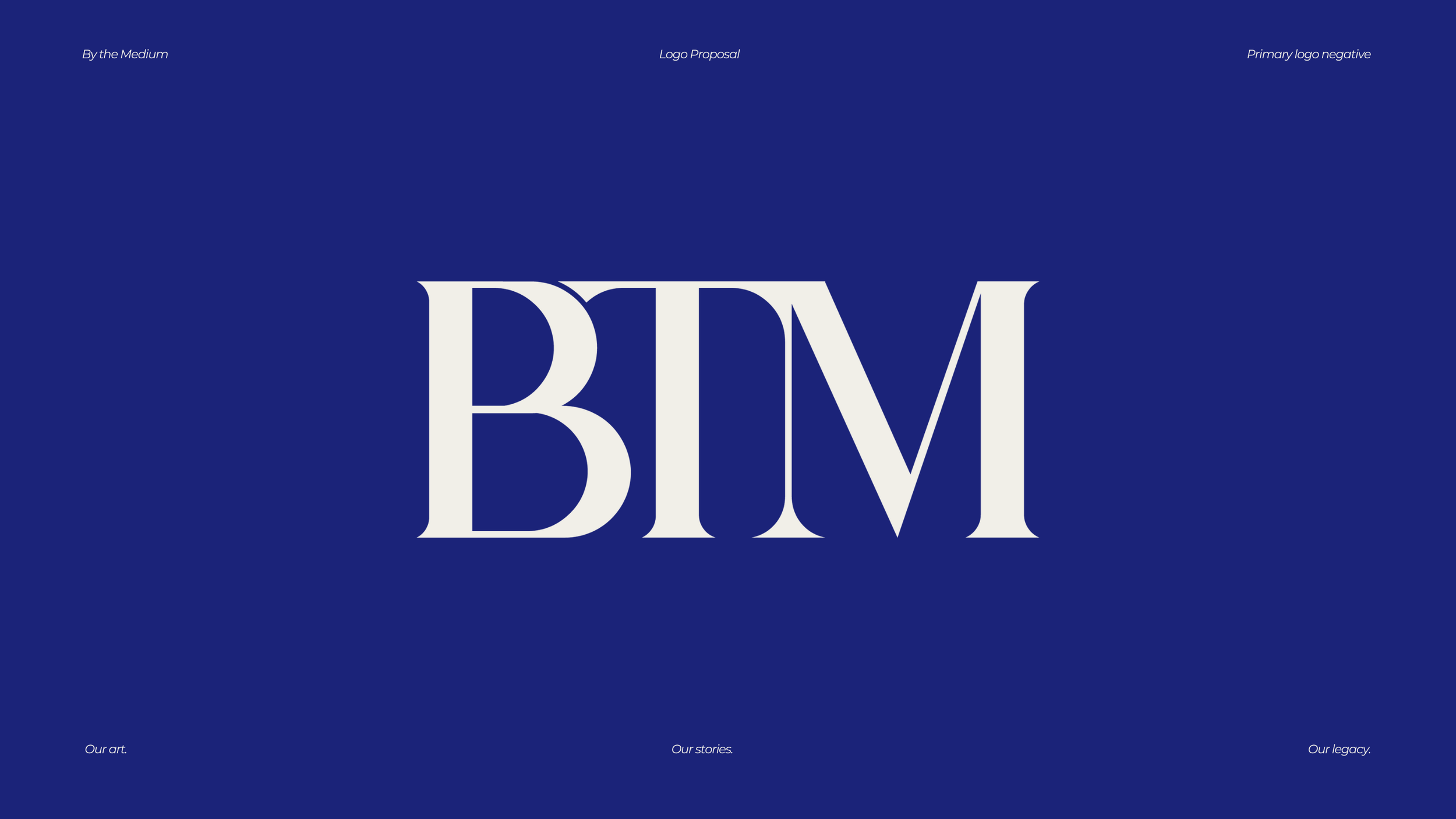
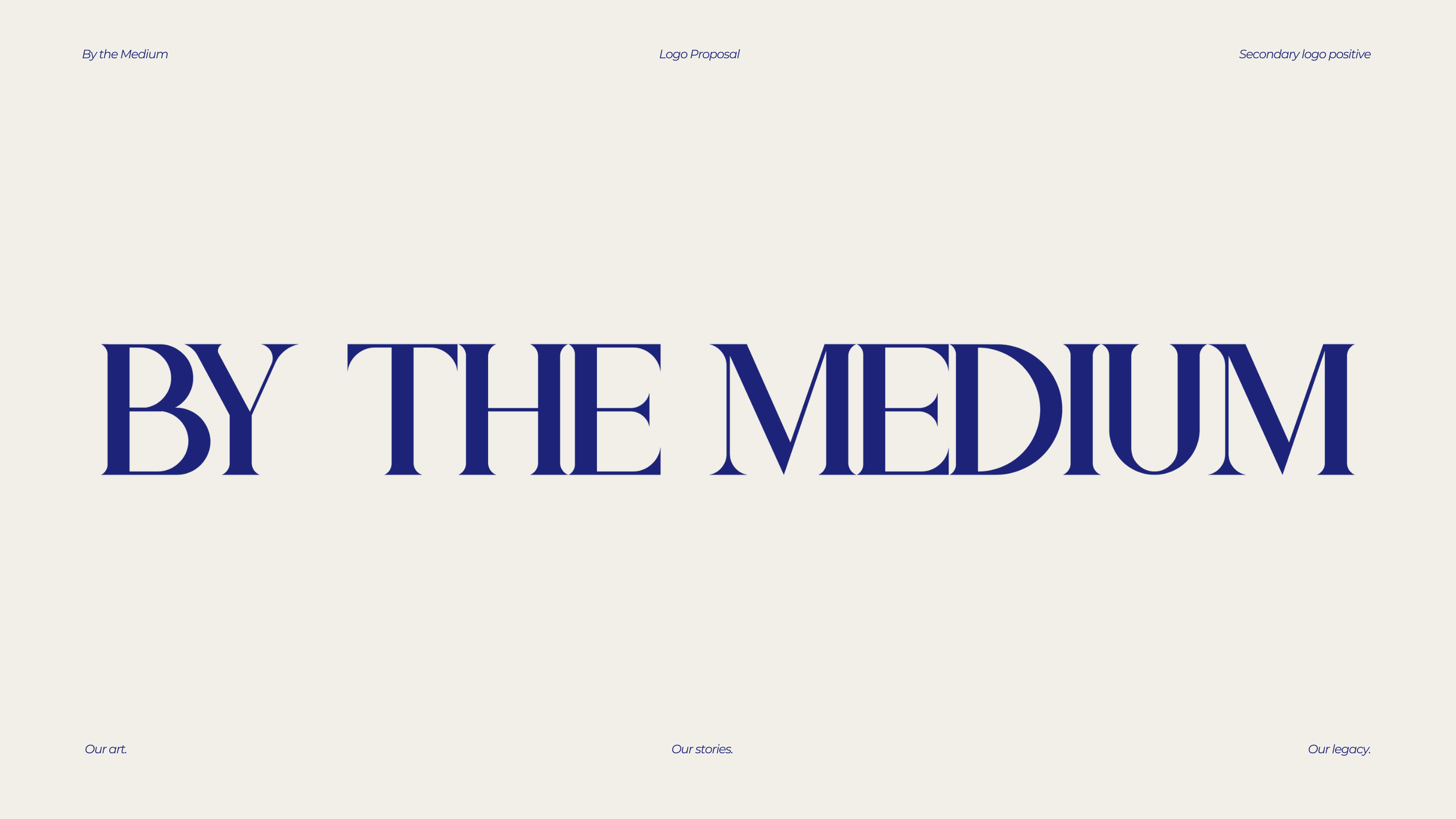
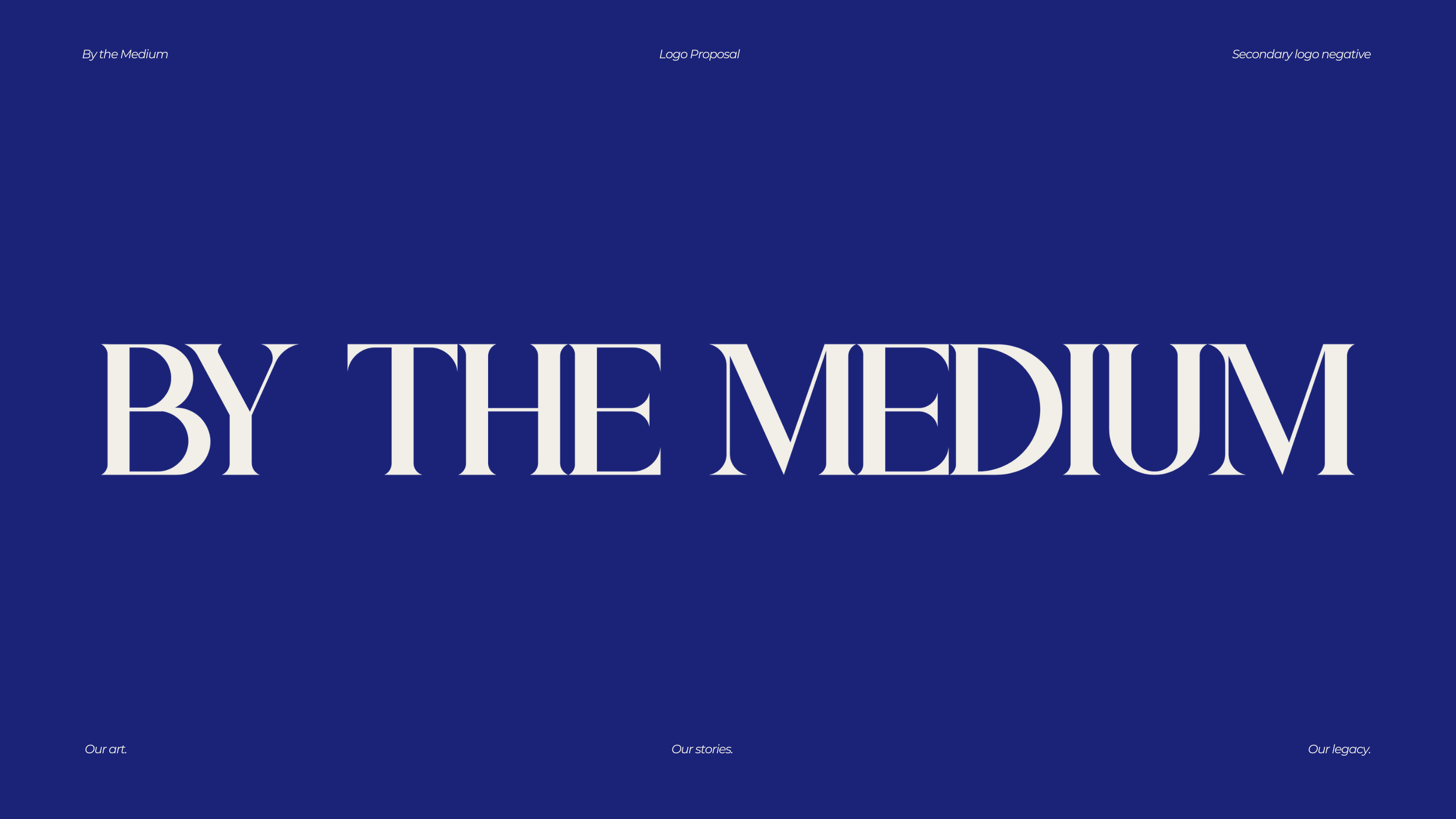
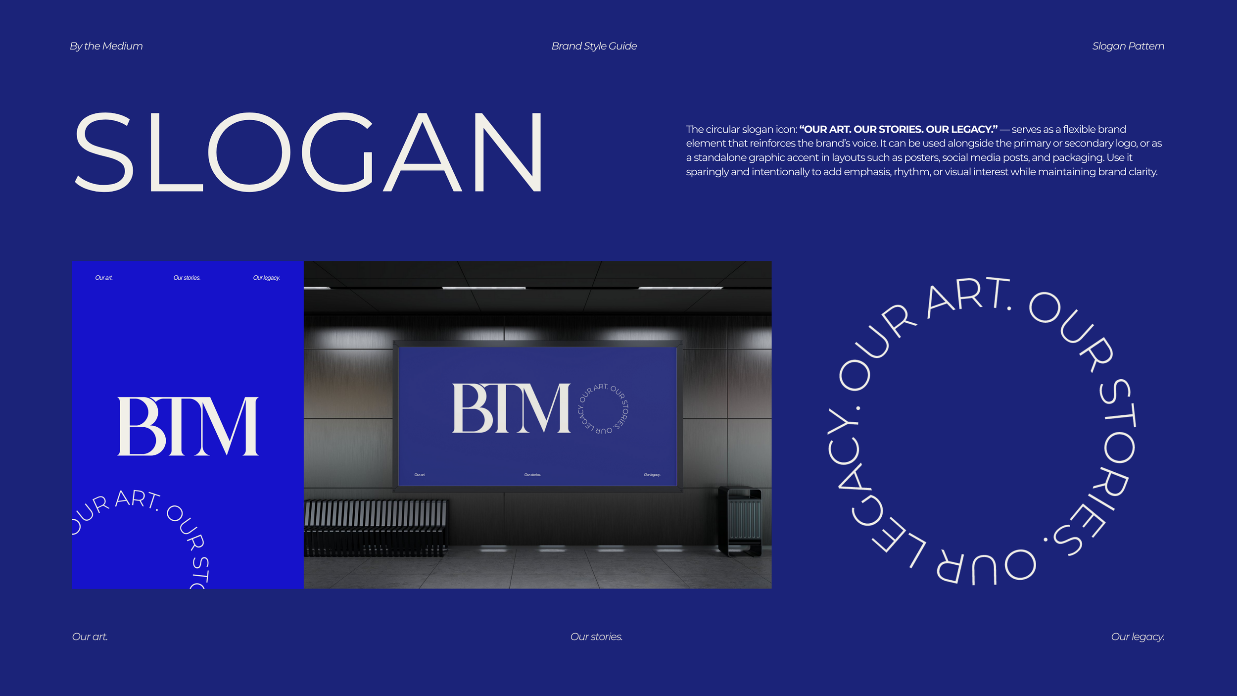
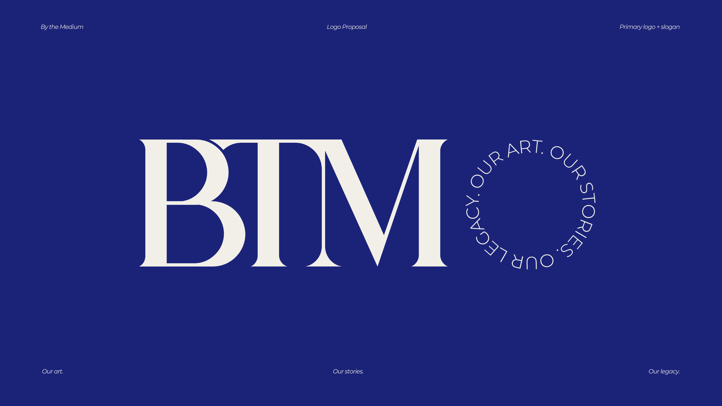
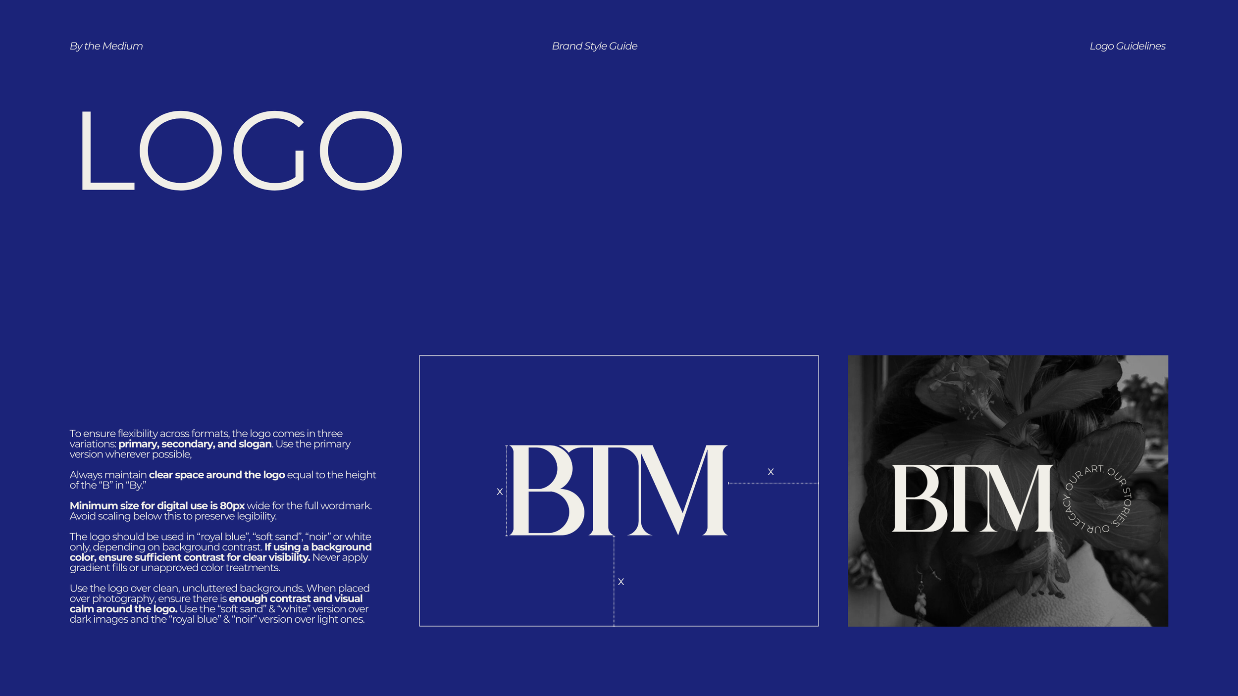
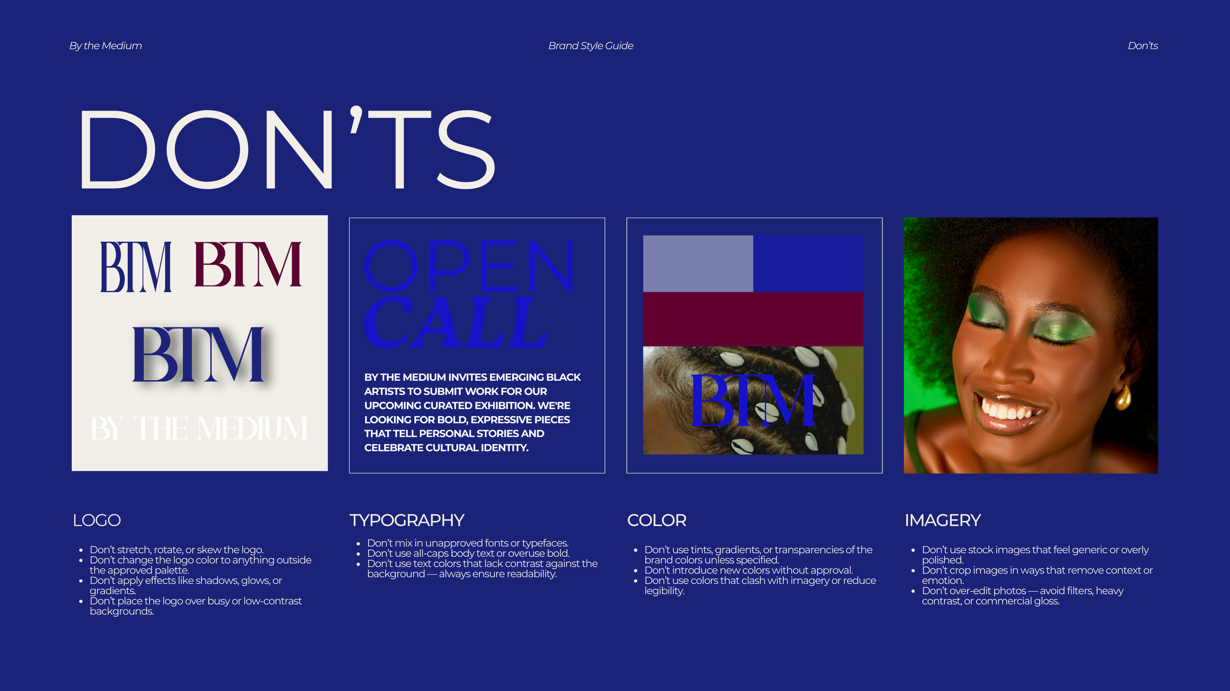
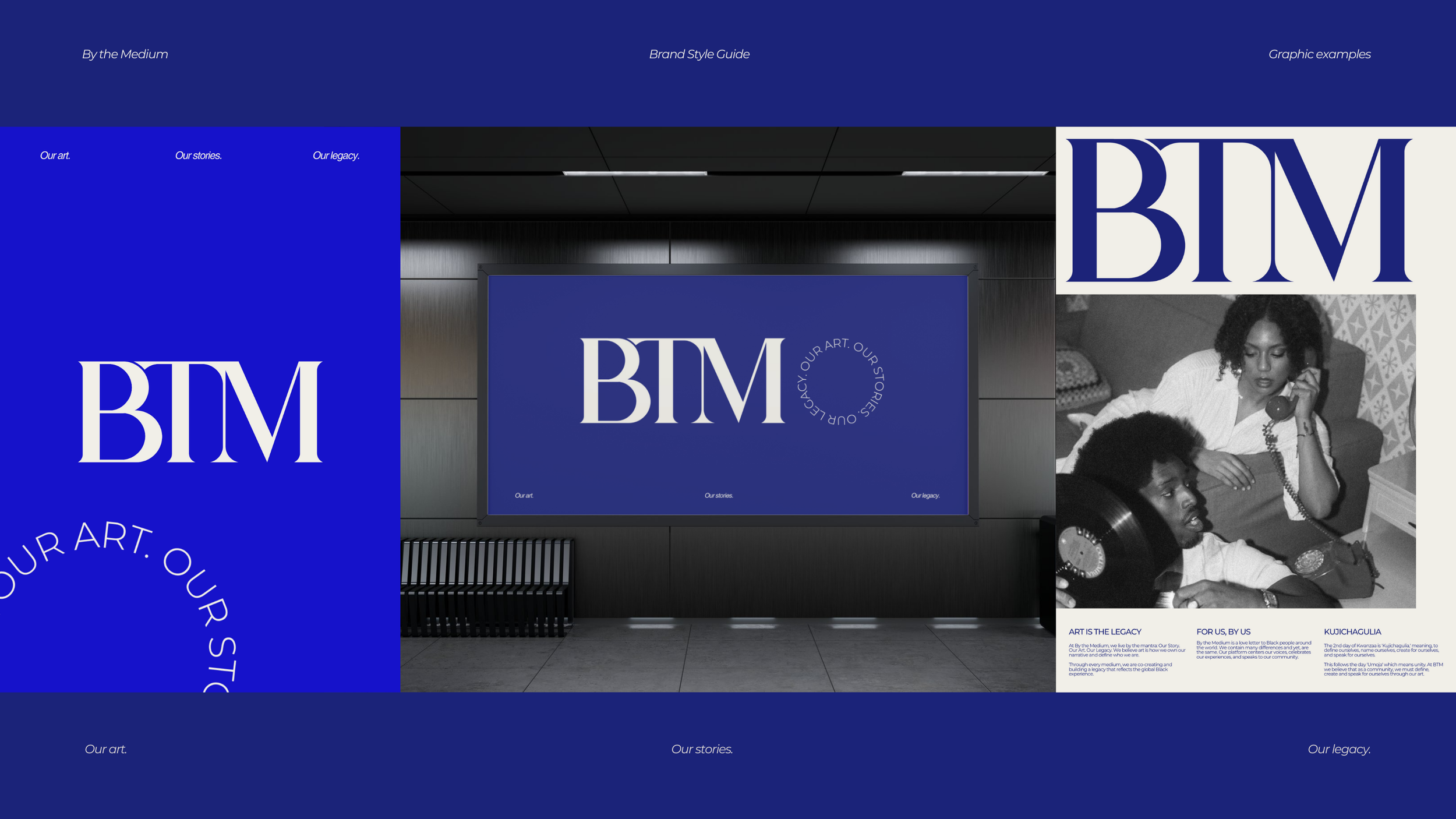
Logo design and variations (primary, secondary, and slogan lockups)
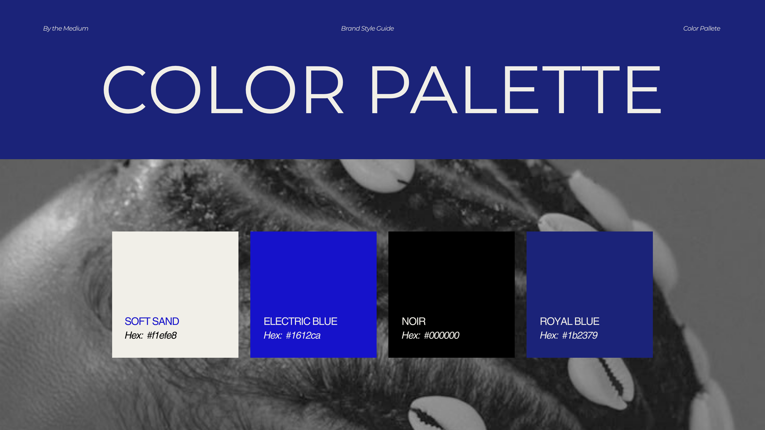
A refined color palette of Royal Blue, Soft Sand, Noir, and Electric Blue
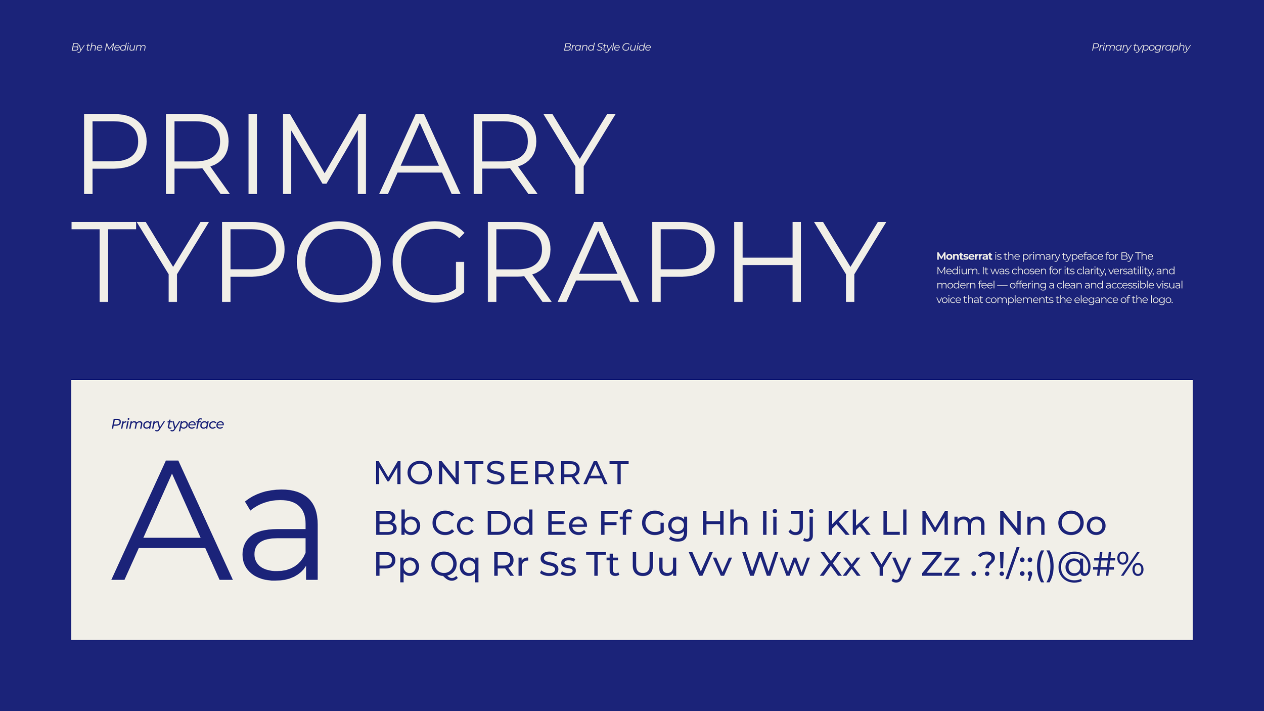
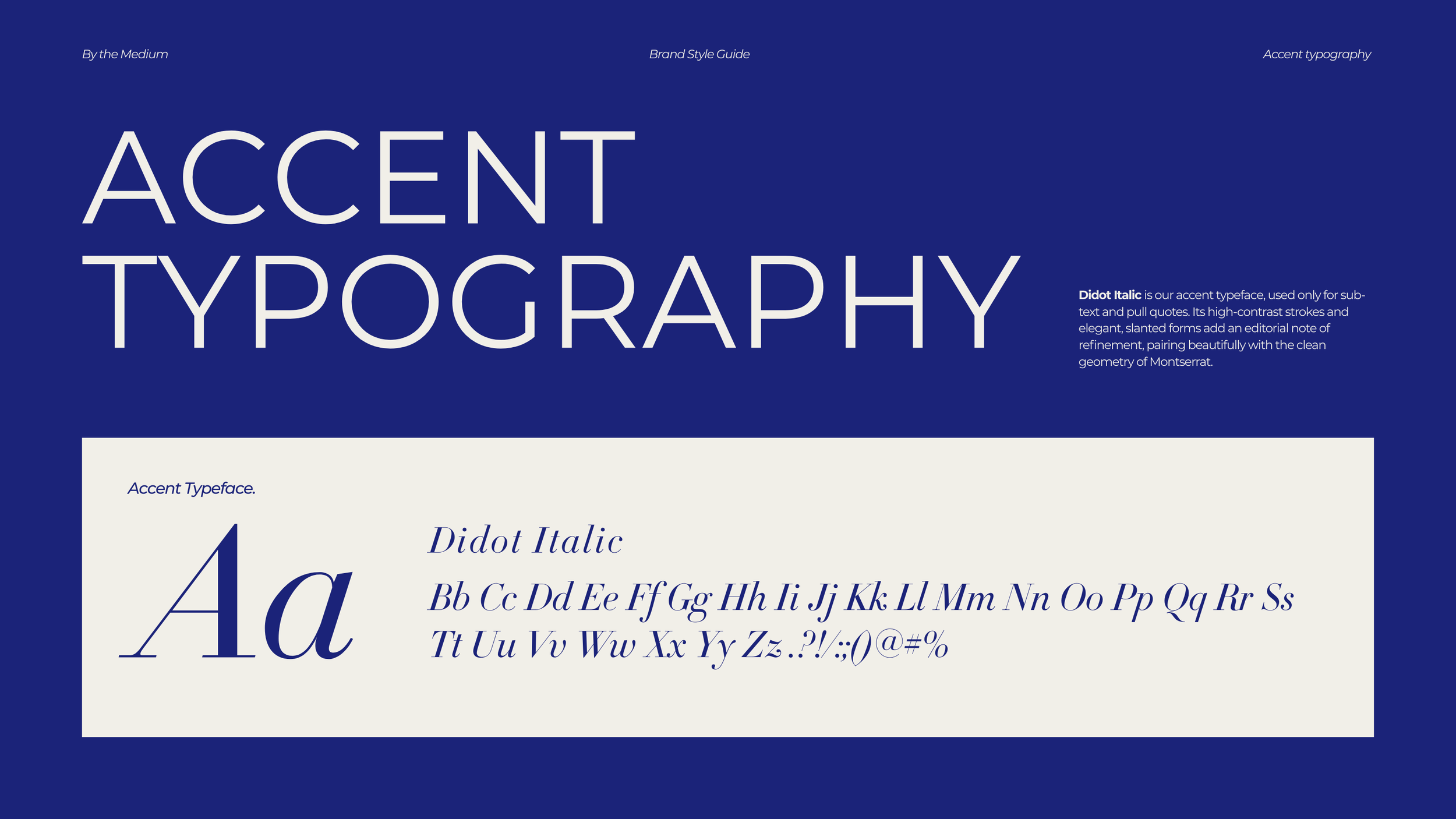
Typography system pairing Montserrat with Didot Italic for editorial nuance
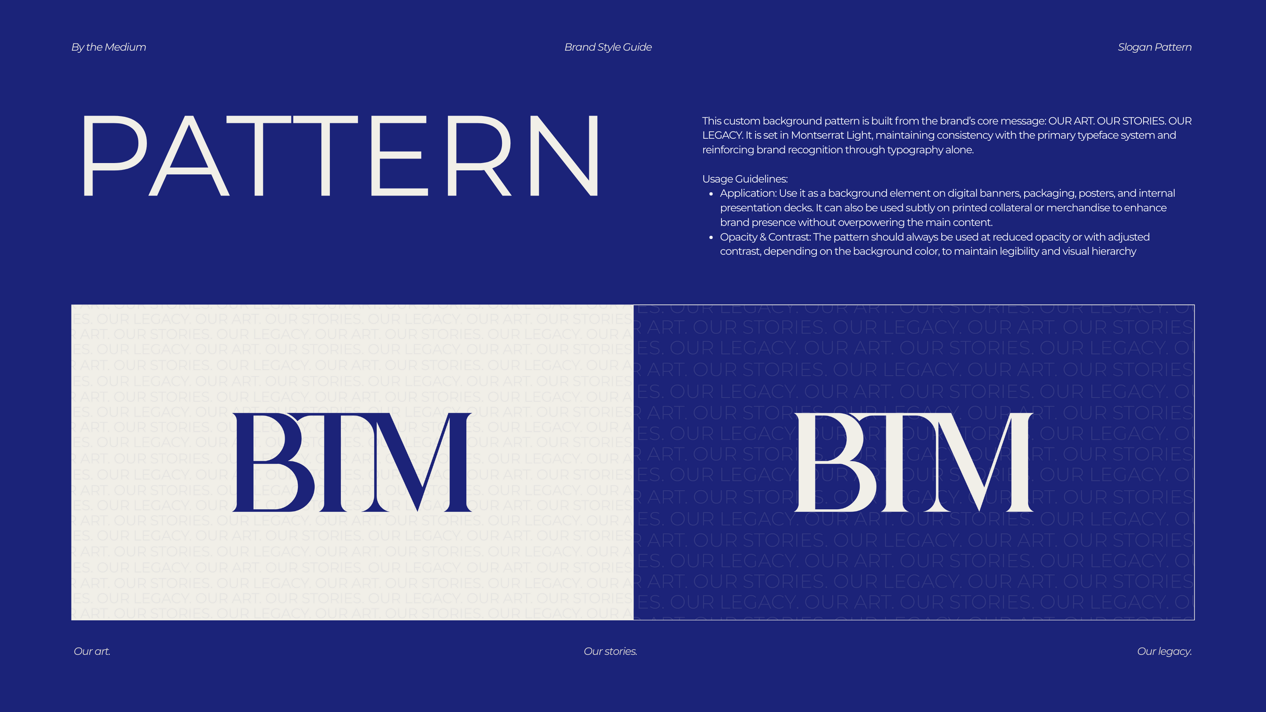
A custom pattern system built from the brand mantra: Our Art. Our Stories. Our Legacy.
Guidelines for imagery style — prioritizing raw, expressive, and community-rooted photography

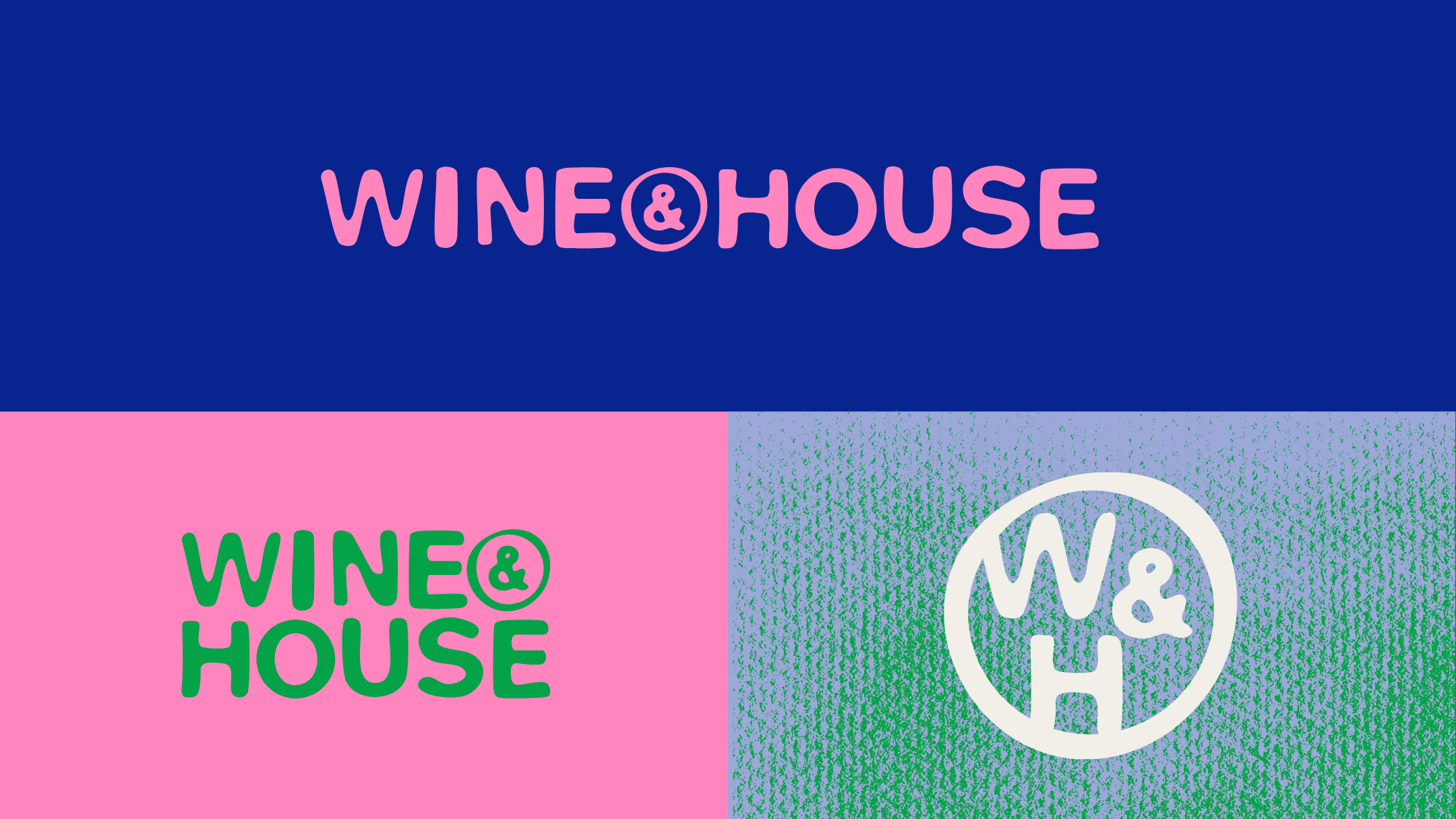
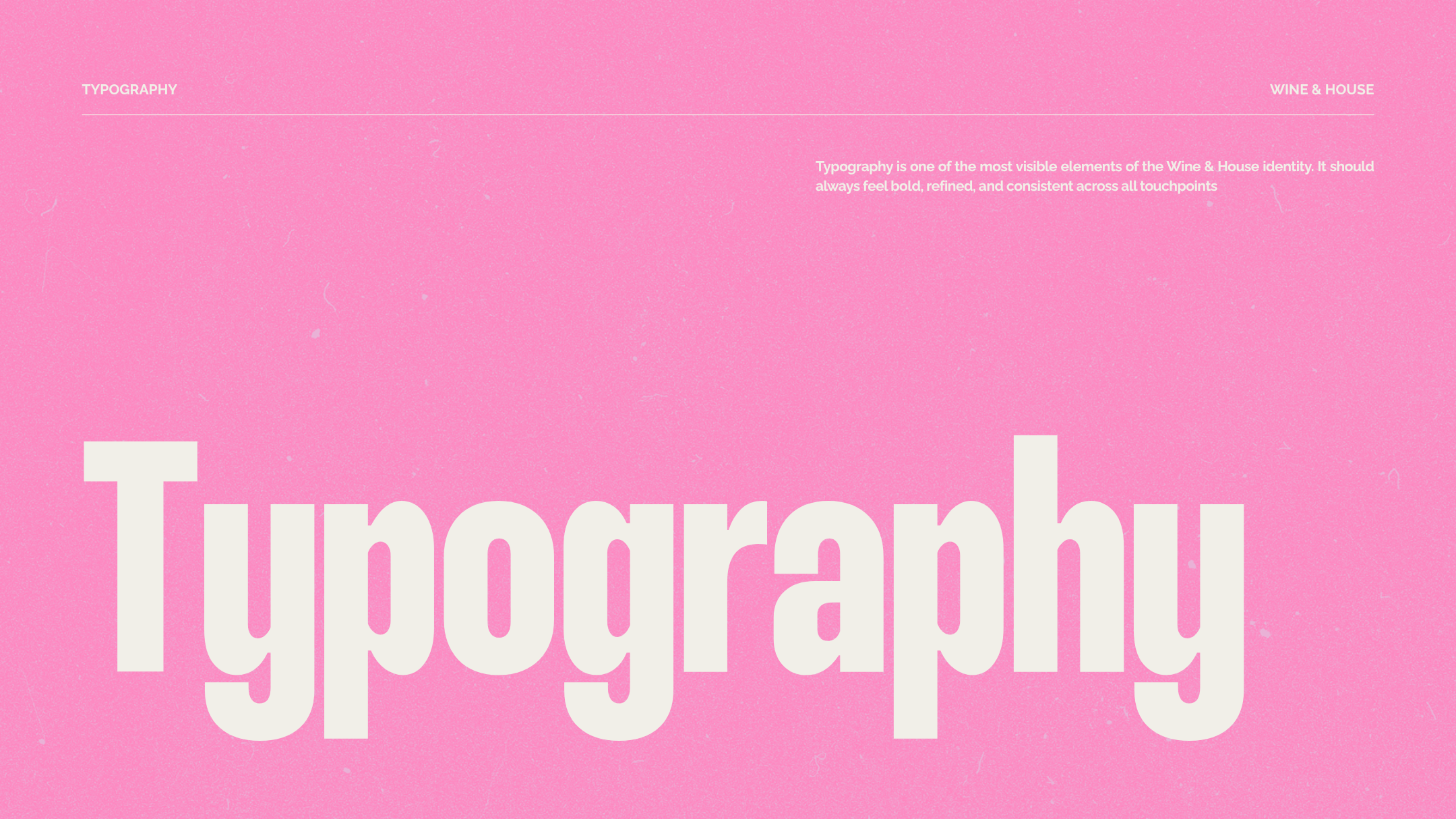
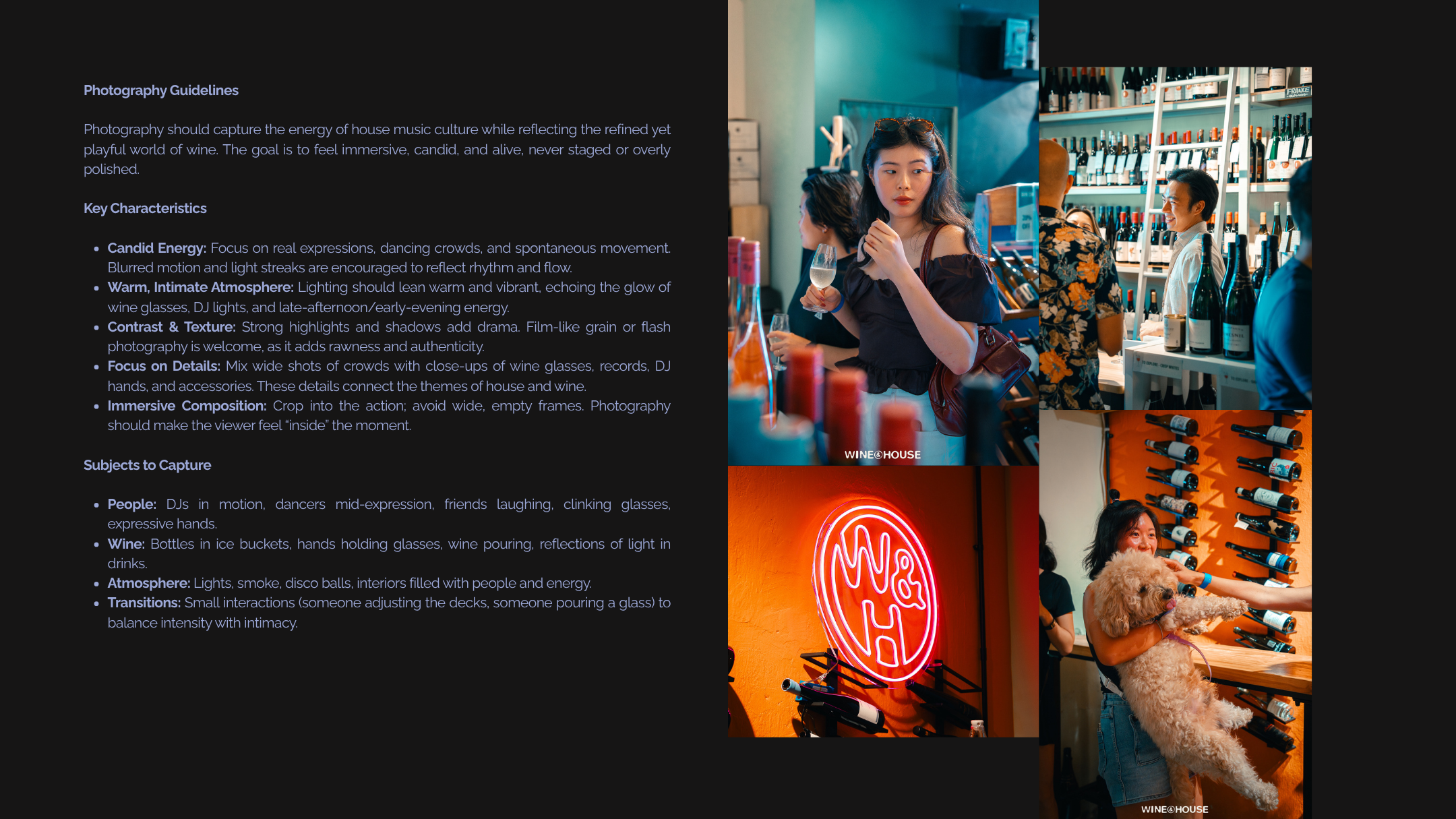
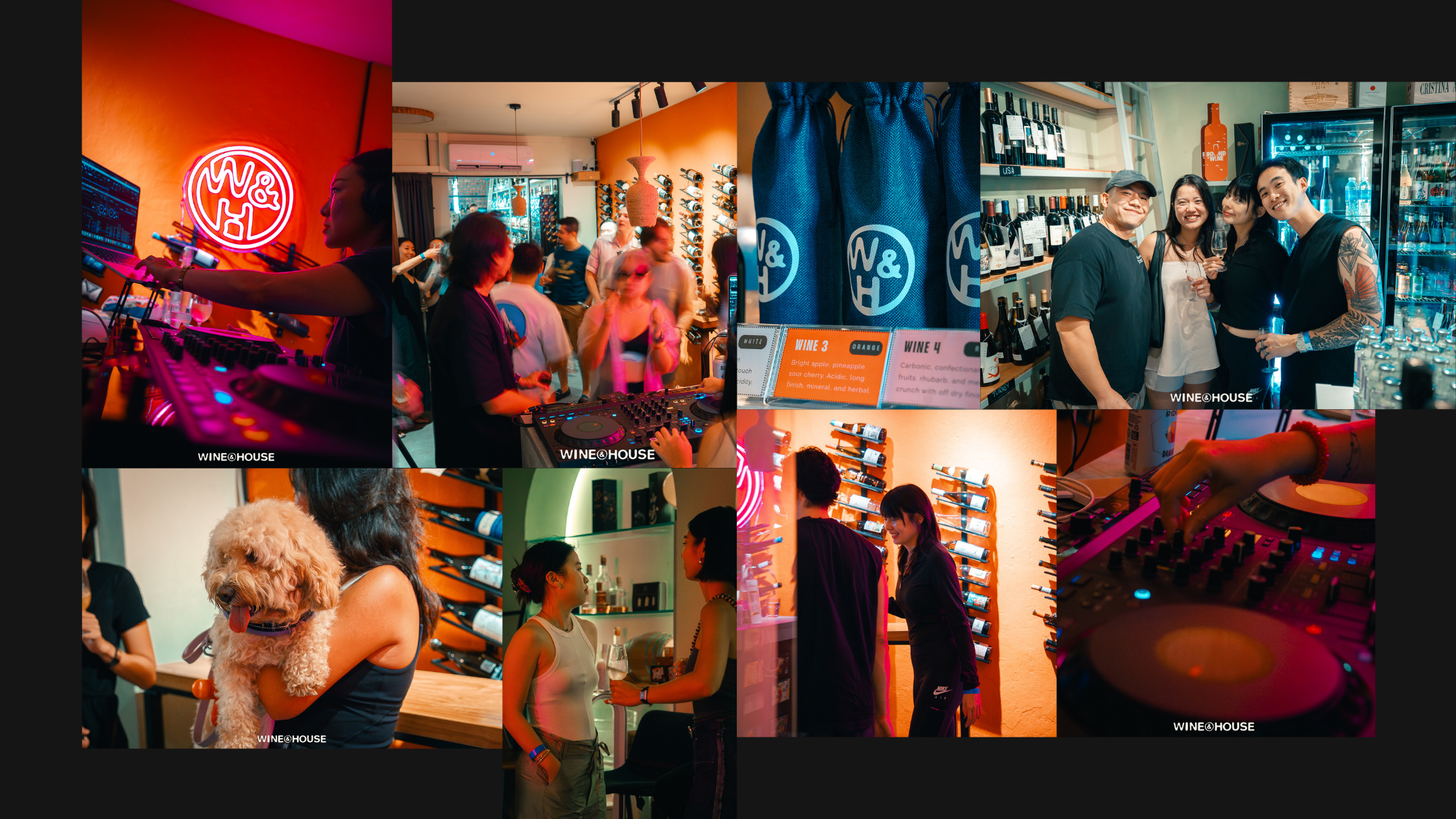
Wine & House
For this project, I developed a complete brand identity for Wine & House, a concept that fuses the sophistication of wine culture with the vibrant energy of house music. The goal was to create a visual language that feels energetic yet elegant, reflecting both nightlife intensity and refined social experiences.
The brand book defines every element of this identity — from logo systems and typography to color palettes, photography, illustration, and social media direction.
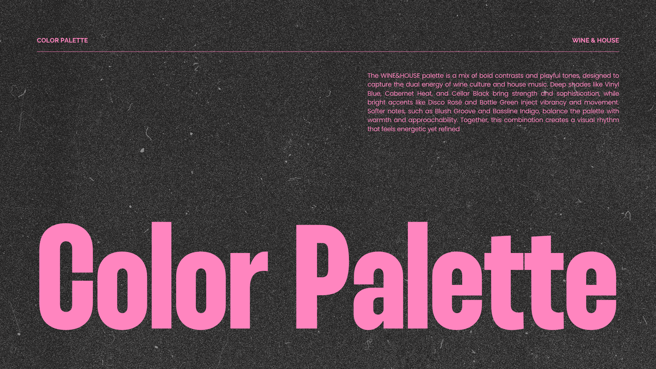
Using bold contrasts like Vinyl Blue and Disco Rosé, expressive typography (Thunder and Raleway), and a confident visual rhythm, the design captures the dual spirit of celebration and sophistication that defines the brand


Swydo Brand Refresh.
As part of Swydo’s evolving journey, we led a comprehensive brand refresh to reflect the company’s growing identity as a modern, approachable, and reliable platform for online marketing reporting. The goal was to align the visual language with Swydo’s mission to “empower marketers to communicate meaningful insights,” while enhancing clarity, accessibility, and personality across all touchpoints.
This refresh spanned across several core elements:
Color Palette – Revamped for stronger contrast, better accessibility, and improved brand recognition.
Typography – Transitioned to modern typefaces like Outfit and Inter for improved hierarchy, legibility, and unified usage across products, web, and social platforms.
Shapes and Visual Language – Introduced a system of geometric forms symbolizing the brand’s core values—Smart, Simple, and Reliable—bringing consistency and meaning to design assets.
Logo Rework – Assessed and iterated on the original logo, highlighting areas of improvement and exploring options for a more scalable, legible, and cohesive identity mark.
This project was driven by a deep understanding of user experience, design scalability, and brand consistency—resulting in a system that not only looks better but communicates better.


Swydo Logo.
As part of the broader Swydo brand refresh, we reimagined the logo to better reflect the company’s evolution and its values: Smart, Simple, Reliable. The original logo, while colorful and friendly, lacked clarity, scalability, and a clear visual rationale, especially in digital environments and small-scale applications.
The new logo introduces a refined, modern wordmark paired with a bold, geometric icon that mirrors our updated visual language and shape system. Each form in the symbol represents one of Swydo’s core brand values, creating a flexible yet cohesive identity system.
Key improvements:
Improved Legibility: Clean typography using the Outfit typeface ensures readability across all platforms and sizes.
Scalable Design: The simplified symbol maintains clarity even in small applications, resolving issues with the original design.
Modern Aesthetic: The updated logo feels fresh, balanced, and aligned with Swydo’s renewed focus on accessibility, consistency, and user experience.
This redesign balances brand personality with clarity and precision—positioning Swydo as a confident, future-ready presence in the digital marketing space.


Tutu.
The branding for Tutu reflects its mission to create a sense of calm, security, and independence for seniors. The logo embodies simplicity and warmth, with soft, approachable shapes that resonate with the device’s friendly and supportive nature. The color palette is carefully selected to evoke serenity and trust, featuring muted tones like soft blues and calming neutrals, complemented by gentle pops of color to create a modern yet inviting feel.
The design prioritizes accessibility, with clean lines and uncluttered visuals that are easy on the eyes. Rounded shapes dominate the aesthetic, mirroring the device's comforting role in users’ lives. These shapes also give a sense of unity and continuity, reinforcing the idea that Tutu is a seamless addition to everyday life.
The overall branding ensures that Tutu is not just seen as a functional gadget but as a dependable companion, a symbol of empowerment and reassurance in a stylish, understated form.


Sisyphus.
Introducing Sisyphus, an ADHD-friendly app that helps break down your tasks into smaller, manageable steps, so you can avoid feeling overwhelmed and stay productive. The app is personalized to fit your needs, offering motivation with a touch of tough love, reminding you of the rewards waiting for you or the consequences if things get left undone. Plus, we make sure you don’t forget to take those much-needed breaks.
With Sisyphus, the boulder feels lighter, and every step forward counts. Let us help you conquer your to-do list, one task at a time!


Coffee Queen.
This branding design is for a small coffee distribution company in Republic of Moldova. I opted for a combination logo because it works great for a startup, it give the audience multiple visual cues when they come in contact with your business and helps them to remember it. The client requested a simple design and colour palette as well as a posibillity to use the elements of the logo separately


